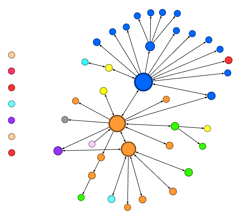
The effectiveness of the PCN is being documented in a few ways. One of the approaches being used is to monitor the growth (or expansion) of the network, in terms of outcomes such as the number of participants, the number of collaborations, and the number of different academic units involved. This is nicely presented in the following network map:

Legend:
- Circles: Each circle represents a different network participant.
- Circle size: The size of each circle in the diagram reflects the number of collaborations completed by each network participant. The larger the size of the circle, the more collaborations completed by that participant.
- Circle colour: Each circle colour represents a different academic unit on campus.
- Arrows: Arrows represent links between participants in the network. The direction of the arrowheads indicates which person was the observer or observee in each collaboration. The more arrows pointing towards and/or away from each circle, the more interactions that participant has had within the network.
- Unconnected circles: The circles that are not connected with other circles by arrows are participants who have not had an observation completed yet, but are scheduled to, or have expressed an interest in participating. Once an observation is completed, the participant is added to the network and the appropriate connections made between the participants.
